One of the many questions that people are aware of but don’t really understand how much thoughts and effort is put into in your interior design is the colors, . While you might think there are a primary set of colors that can be found in almost every home, the arrangement of each color and the pairing of them are both something an interior design has to really spend time on, not just something that “looks good” will do, even a Singapore interior designer would agree with this.
So what goes into consideration when designing the color themes in a home? For starter, the functionality of the space. The living room should have a different vibe from the bedroom, the master bedroom generally feels different from the children’s bedroom. After setting up a clear direction of how the space should feel in each space, that’s where the psychology of colors come in to help.
Another thing people often don’t notice is that the colors in interior design absolutely go beyond wall, ceiling paints and large furniture. The lamp in your living room corner, the vase sitting in your kitchen are all a part of a greater colors theme.
Of course, not every person on earth will feel exactly the same toward the same colors or a combination of colors. However, the psychology in interior design aims to deliver to a more general population with themes that are more general. For example, almost everyone associates black with night and white with daytime or brightness. While some might feel a little stronger and more emotions toward white, white would be the color to go to for brightness and a positive vibe.
So what are the colors that are often used in interior design and what are their psychology effects? Here are some small examples:
The Master’s Bedroom
In most homes, the master’s bedroom is one of the most authoritative space in the house. Unlike a nursey, the master’s bedroom usually provide a stable, elegant vibe with a color theme that caters to both sexes.
Healing Aloe
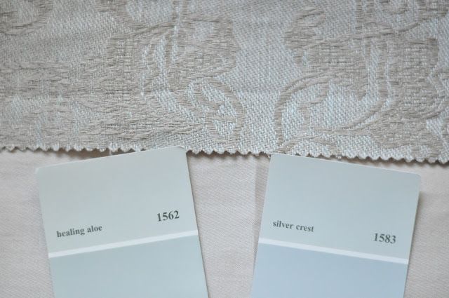
Image source: pinterest
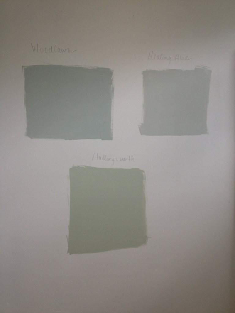
Image source:theestateofthings.com
Healing Aloe is a combination of blue, gray or green and can look either of them in different lighting situation or just by different people. The soft, elegant and tranquil vibe that comes with the color makes it one of the more popular choice of wall paint.
Khaki Green
Image source: houzz.com
For a contemporary touch, Khaki green is a cool looking color that has the rare ability to mix well with colors that are on the more classy and elegant side, perhaps it’s the peacefulness in khaki green that makes it go so well with the home space.
Quartz Moon
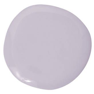
Image source: pinterest
Quartz moon is a shade of lavender that is excellent with natural lights, the subtleness in colors also makes quartz moon a very gender neutral color, not too feminine, not too masculine. A perfect balance in the master’s bedroom.
The Children’s Room
Lavender
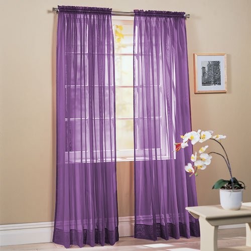
Image source: bumopodir.blogspot.com
With all the entertainment and activeness going on in your children’s room, a touch of lavender can serve as the calming factor in the room, also brining a little bit a sophistication into the room.
Yellow
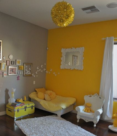
Image source: valiant-design.com
The ultimate color of youth and playfulness, through the proper balance of yellow and other more calming colors will bring your kid’s room to live without being “too loud”.
Marine Blue
Image source: talkandsleep.wordpress.com
The classic “the boy’s room” color, never gets out of style. Energetic, bright but not too much that one can’t relax when seeing it.
The Living Room
The Gray-Blue-Green combo
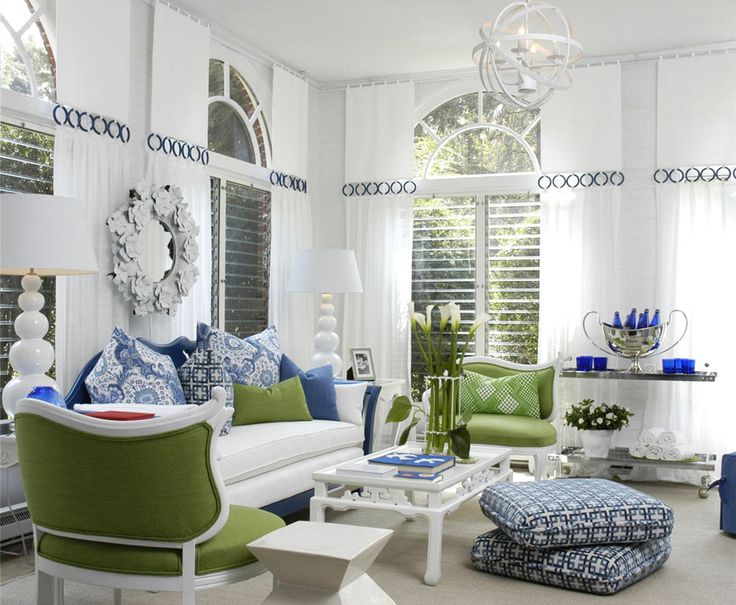
Image source: pinimg.com
All the calming colors roll into one to create a calming effect with a hint of the excitement of outdoor. A popular color combination for the family who enjoys a little outdoors but also enjoy spending a relaxing Sunday afternoon in the living room with loved ones.
Red
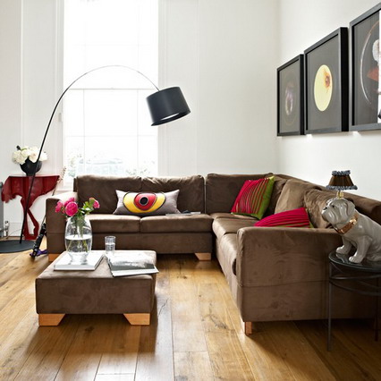
Image source: decorwoo.blogspot.com
More than just a Taylor Swift hit song, a little bit red in your living room creates excitement and makes your living room feel more inviting to guests.
Greige
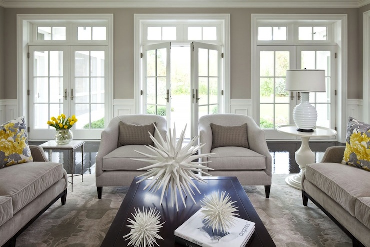
Image source: decorpad.com
A very neutral and relaxing color tune that does very well with natural light, works well with modern home design but also suitable for a vintage scene with its elegance and class.
Related (7 Open Concept Ideas For Your HDB Flats)
Cheerful Blue
Want something a little more cheerful for your living room but don’t want to turn it into a kid’s room? A decent amount of cheerful blue will do.
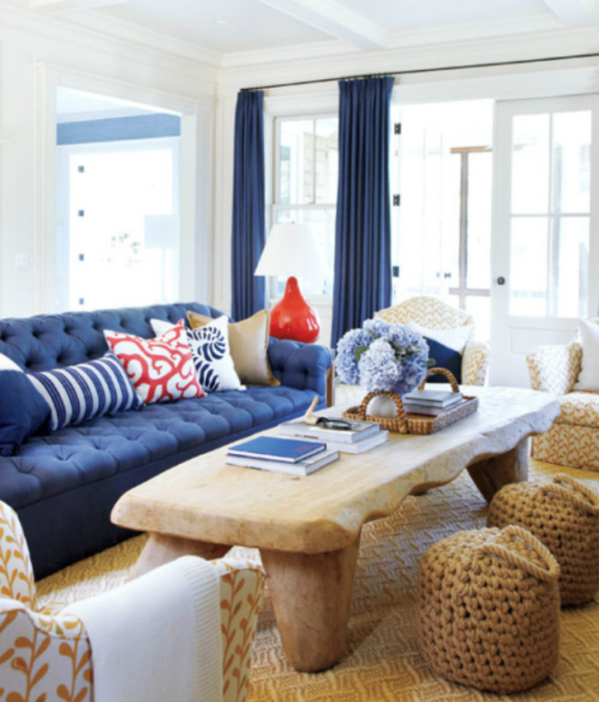
Image source: decoratorsbest.wordpress.com
Kitchen
Gray & Woodlawn Blue
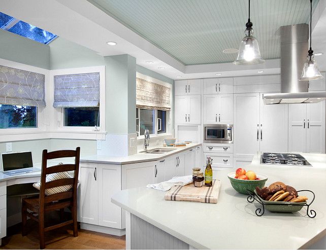
Image source: pinterest.com
A splash of edginess and impact in your kitchen, taking a little break from all those warming colors.
Warm Sienna
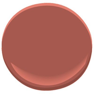
Image source: pinterest.com
A cozy and warm color , soft on the eyes and comforting like mom’s home cooking.
Golden Honey
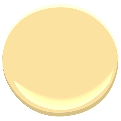
Image source: benjaminmoore.com
A delight among your wooden furniture, bringing a little bit of sunshine in the kitchen.
Golden Brown Sugar
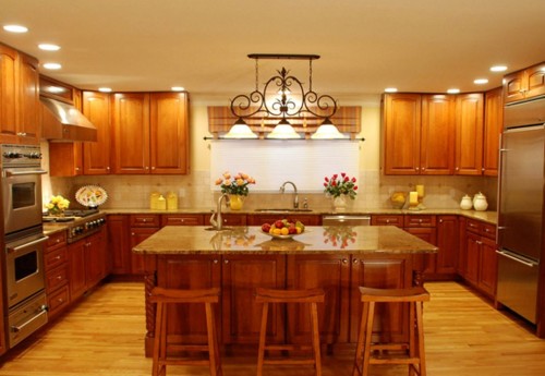
Image source: hotalizee.com
A warm, comforting color that relaxes you while making the food in the kitchen even more appetizing.
Cream Stone
Dining Room
Midnight Sky
Image source: blog.countrychicpaint.com
The all-time champion of delivering a sophisticated, elegant vibe into any setting and space, the midnight sky in dining space also brings out the class vibe.
Truffle Brown
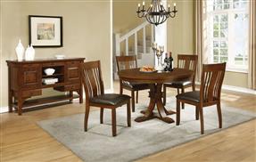
Image source: theclassyhome.com
A lift for your airy white ceiling and a seamless look in your dining room.
Apple Green
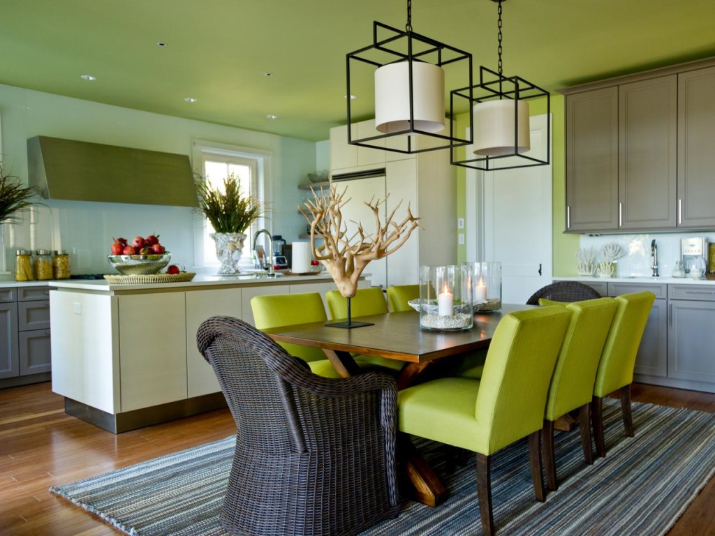
Image source: solelyhouse.com
A fresh look for your dining room, energetic and a modern vibe in the space that’s traditionally warming, making your dining just a tad more interesting while still staying on the warm and comforting side.
Spicy Orange
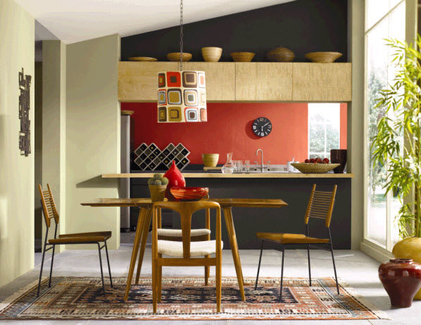
Image source: postmoderndir.blogspot.com
A great color to break away from the warmth, also a great add-on to avoid making your dining room looking too intense or serious.


